Table of Contents
Introduction
Matplotlib is the omnipresent plotting library for data science with Python. Seaborn is another Python data visualization tool, created on top of Matplotlib. In this cheat sheet I will use them along with Pandas’s plotting capabilities. Pandas integrates with Matplotlib to make plotting even easier.
Data used in the examples:
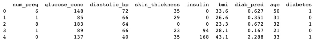
df.head()
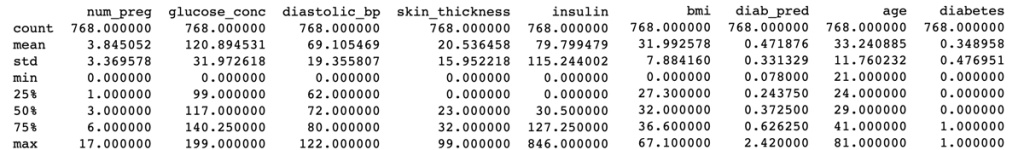
df.describe()
Importing libraries and Loading the data
import matplotlib.pyplot as plt
import seaborn as sns
import pandas as pd

%matplotlib inline #use this to display inline plots on Jupyter notebooks

df = pd.read_csv('./path/data.csv')
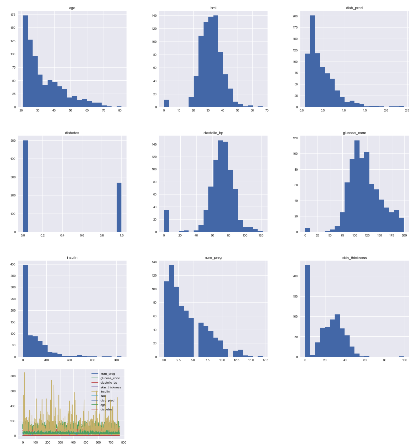
Histograms
Are used to get insights about data distribution. Too few bins can oversimplify reality and won’t show you the details, conversely too many bins tend to overcomplicate reality and won’t show the details.
Using Pandas’s integration with Matplotlib
df.hist(bins=20, figsize=(24, 22))
# df['insulin'].hist(bins=20, figsize=(22, 20)) # This would print only one series
df.plot()
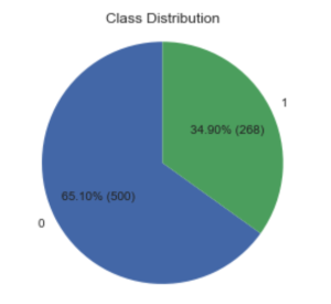
Pie Chart with Matplotlib
This kind of chart can be used to check class distribution on a dataset.
counts = df['diabetes'].value_counts()
labels = counts.index.values # array([0, 1])
values = counts.values # array([500, 268])

def make_custom_autopct(values):
    def custom_autopct(pct):
        total = sum(values)
        val = int(round(pct*total/100.0))
        return '{p:.2f}% ({v:d})'.format(p=pct,v=val)
    return custom_autopct

fig1, ax1 = plt.subplots()
plt.title("Class Distribution")
ax1.pie(values, labels=labels, autopct=make_custom_autopct(values), startangle=90)
ax1.axis('equal') # Equal aspect ratio ensures that pie is drawn as a circle.
plt.show()
Bar Chart with Matplotlib
import numpy as np
%matplotlib inline
df = pd.read_csv('./data/pima-data-orig.csv')
# print(df.head())
counts = df['diabetes'].value_counts()
labels = counts.index.values # array([0, 1])
values = counts.values # array([500, 268])
# Dividing into groups of ranges
groups = int(df['num_preg'].max() / 4)
labels = []
for i in range(groups):
start = i * groups
end = start + (groups - 1)
labels.append(str(start)+'-'+str(end))
# labels.append(str(start)+'-'+str(end)+':P')
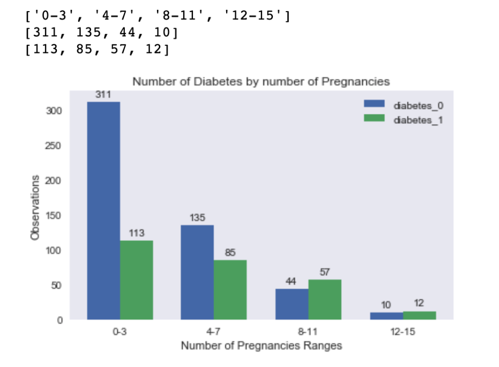
print(labels) #['0-3', '4-7', '8-11', '12-15']
diabetes_0 = []
diabetes_1 = []
for i in range(groups):
# TODO deal with the last range so it gets all greater than
start = i * groups
end = start + (groups - 1)
df_filtered = df[(df['num_preg'] >= start) & (df['num_preg'] <= end ) & (df['diabetes'] == 0 )]
df_filtered2 = df[(df['num_preg'] >= start) & (df['num_preg'] <= end ) & (df['diabetes'] == 1 )]
diabetes_0.append(len(df_filtered['num_preg']))
diabetes_1.append(len(df_filtered2['num_preg']))
print(diabetes_0) # [311, 135, 44, 10]
print(diabetes_1) # [113, 85, 57, 12]
x = np.arange(len(labels)) # the label locations
width = 0.35 # the width of the bars
fig, axes = plt.subplots()
rects1 = axes.bar(x - width/2, diabetes_0, width, label='diabetes_0')
rects2 = axes.bar(x + width/2, diabetes_1, width, label='diabetes_1')
# Add some text for labels, title and custom x-axis tick labels, etc.
axes.set_ylabel('Observations')
axes.set_xlabel('Number of Pregnancies Ranges')
axes.set_title('Number of Diabetes by number of Pregnancies')
axes.set_xticks(x)
axes.set_xticklabels(labels)
axes.legend()
def autolabel(rects):
for rect in rects:
height = rect.get_height()
axes.annotate('{}'.format(height),
xy=(rect.get_x() + rect.get_width() / 2, height),
xytext=(0, 3), # 3 points vertical offset
textcoords="offset points",
ha='center', va='bottom')
autolabel(rects1)
autolabel(rects2)
fig.tight_layout()
plt.show()
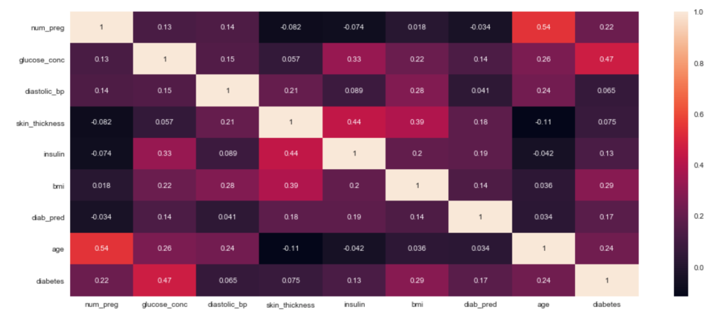
Heatmap with Seaborn – Correlation Matrix
correlation = df.corr()

plt.figure(figsize=(18,8))
sns.heatmap(correlation, annot = True)
plt.show()
References
https://seaborn.pydata.org/
What do you think?