Table of Contents
Introduction
In this post I will comment on the steps in the Machine Learning Process, and show the tools (python libraries and code) used to accomplish each step.
The objective of this post is to have a central place to come and “remember” the ML flow, the tools, and why every step is important.
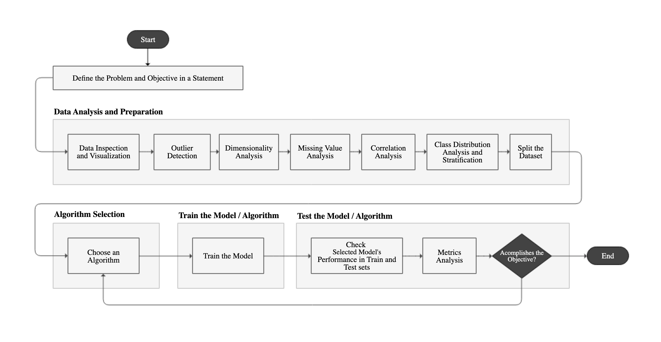
Below is a flowchart of each step, divided into main categories: Data Analysis and Preparation, Algorithm Selection, Model Training and Model Testing.
Define the Problem and the Objective in a Statement
Before starting the application of Machine Learning, it is necessary to define the problem we are trying to solve and the objective of the project, because the process is huge, making it easy to lose focus. The statement must provide a clear direction of what we are trying to accomplish. A good statement has the scope, the data source, target performance, context usage and how the solution will be created. See example below:
Use the Machine Learning process to prepare and transform customer data, retrieved from our database of customer deals, to create a prediction model which must predict which client is most likely to decline an offer, in order to offer alternative forms of deals, with an accuracy of 85% or greater.
Data Analysis & Preparation
This part of the ML process is the one which takes the most time. It usually takes 70% to 80% of the entire process and is a very “manual” process. The sub steps of this part don’t necessarily need to follow the presented sequence.
Data Inspection
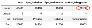
In this step we should inspect the data to get familiarized with it, to check if there are null values, the data types (that generally must be numeric), kinds of values per attribute…
Commands/Tools
data_frame['some_attribute'].unique() #to show distinct values for an attributeimport pandas as pd #the well known dataframe library

df = pd.read_csv("./path/to/file.csv")
data_frame.columns # list column title
data_frame.shape
data_frame.sample(10) #Returns a random sample of items from an axis of object.
data_frame.head(5)
data_frame.tail(5)
data_frame.info() #gives us a quick description of the data
data_frame.describe() #shows the a summary of numerical attributes
data_frame.isnull.values.any() #check for null values
data_frame['some_attribute'].value_counts() #to show how many values each category or value - without NAN
data_frame['some_attribute'].value_counts(dropna=False) # show nan too
data_frame['some_attribute'].unique() #to show distinct values for an attribute
data_frame.nunique() # to show distinct count of values for all tables
data_frame.head(5)#check for change
Checking Data Types
data_frame.dtypes
Converting Pandas Data Frame Types
Will convert all “object” data types into numeric.
columns = df.columns
df[columns] = df[columns].apply(pd.to_numeric, errors='coerce')
Counting NAN and Null by column
df.isna().sum()
df.isnull().sum()
Separating Categorical and Numerical Data for Analysis
Extracting Categorical Data
categorical_indexes = data_frame.dtypes[data_frame.dtypes == 'object'].index
data_frame[categorical_indexes].describe()
Extracting Numerical Data
numerical_indexes = [item for item in list(data_frame.columns) if item not in list(categorical_indexes)]
data_frame[numerical_indexes].describe()
Data Visualization – Plotting
Another important way to get a feeling of the data is to plot histograms, scatter plots and line plots etc… Matplotlib is the most common plotting library used to accomplish this.
A cheat sheet of how to plot using Matplolib can be accessed here: Data Visualization with Matplotlib, Seaborn & Pandas – Cheat Sheet.
Outliers
How to Detect
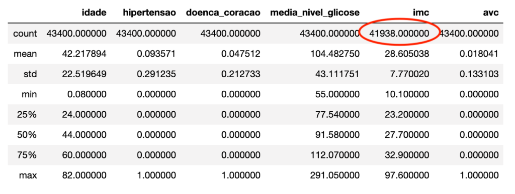
Outliers affect the mean of the data. Detecting and dealing with them is an important part of the Machine Learning Process. An easy way to check outliers is using panda’s describe method.
df.describe()
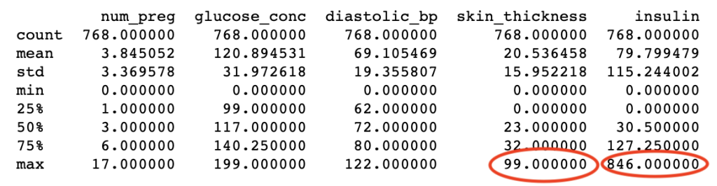
By checking the results we can see that skin thickness and insulin are possible outliers, because they are very distant from the average and the standard deviation.
How to remove
indexes = np.where(df['col_name']>=400)
df = df.drop(df.index[indexes])
Dimensionality Analysis
The objective of this analysis is to find and define a set of optimum attributes, which are relevant for the model and to avoid the curse of dimensionality, which is a phenomenon that reduces the performance of the algorithm after a determined number of attributes. This only occurs in high-dimensional spaces. Motivations for dimensionality reduction are to speed up the training of the algorithm and compression, to save space.
In this step, we can use automated dimensionality analysis algorithms or manually drop attributes that we see add little to no value to the model. It would be useful to create a pipeline to remove irrelevant attributes.
Commands/Tools
# manually removing unneeded attribute columns
data_frame = data_frame.drop(['unneeded_attribute1', 'unneeded_attribute2', 'unneeded_attribute3'], axis=1) #axis=1 is for column removal
Converting Categorial/Qualitative values into Numbers
Most machine learning algorithms prefer to work with numbers, so data values like F (for female), M (male), should be converted to numbers. If we don’t do this explicitly, scikit-learn will internally cast those values into unknown float values.
Label Encoding
The code bellow casts the sex attribute to a category and after that gets the code and sets it as the values of the sex column
dataset['sexo'] = dataset['sexo'].astype('category')
dataset['sexo'] = dataset['sexo'].cat.codes

# Or using mapping

value_map = { "actual_value1": 1, "actual_value2": 0 }
data_frame['column_name'] = data_frame['column_name'].map(value_map)
One-Hot encoding with Scikit-learn
features = pd.get_dummies(features_raw, columns=['Sex']) # will return the Sex columns encoded and renamed with Sex_male, Sex_female
More here: https://pandas.pydata.org/pandas-docs/stable/generated/pandas.get_dummies.html
Missing Analysis
Along with actual clear missing values, it is possible to have some hidden missing values in the dataset; this is bad because most Machine Learning algorithms can’t process missing values. Some systems add a zero (0) instead of null when the data is not available, or even leave the data blank, so a good question is: Is this value possible? Is it really a 0 (in this case) or blank or something else?
For Categorical Data at least four approaches can be used: Label Encoding (up to 3 attributes), One-Hot Encoding (for any number or more than 3 attributes) Remove the line/observation or Remove the Attribute. The decision is up to the Data Scientist. As a general rule i would do the maximum to retain as maximum info as possible. If there are a small number of observations with missing, i could also remove it.
For Numerical Data at least five approaches can be used: Input missing with mean, median or other statistical method, Remove the line/observation or Remove the Attribute.
Inspecting Categorical
categorical_indexes = data_frame.dtypes[data_frame.dtypes == 'object'].index
data_frame[categorical_indexes].describe()
Inspecting Numerical
numerical_indexes = [item for item in list(data_frame.columns) if item not in list(categorical_indexes)]
data_frame[numerical_indexes].describe()
Other Inspection commands
Counting rows with possible missing
print("# rows in dataframe {0}".format(len(data_frame))) # total of rows
print("# rows with 0 - possible missing value: {0}".format(len(data_frame.loc[data_frame['some_column'] == 0])))

#OR

# how many total missing values do we have?
total_cells = np.product(data_frame.shape)
total_missing = missing_values_count.sum()

# percent of data that is missing
(total_missing/total_cells) * 100
Counting missing by column
missing_values_count = data_frame.isnull().sum() # the number of missing data points per column
print(missing_values_count)
Creating new status for a missing Attribute
Sometimes when you have an attribute with lots of missing values that will make you loose info, it is possible to create a new attribute like Unknown.
new_status = np.where(dataset['some_status'].isnull(), "unknown", dataset['some_status'])
dataset['some_status'] = new_status
Dealing with Numerical/Quantitative values
Check Data Distribution
This is an important step because it only makes sense to input the mean if there is a central tendency is the data.
dataset.hist(column = 'imc', figsize=(9,6), bins=20)
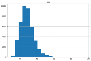
We can see that the data is concentrated in 20 and 40, so it can make sense to input the mean,
Fill missing
With pandas using the mean of the column
df = df['column'].fillna(df['column'].mean())
With the mean using the Imputer class
from sklearn.preprocessing import Imputer

#Impute with mean all 0 readings
fill_0 = Imputer(missing_values=0, strategy="mean", axis=0)

X_train = fill_0.fit_transform(X_train)
X_test = fill_0.fit_transform(X_test)
Fill missing values with 0 and Panda’s fillna
subset_nfl_data.fillna(0)# replace all NA's with 0

# replace all NA's the value that comes directly after it in the same column, (This makes a lot of sense for datasets where the observations have some sort of logical order to them.)
# then replace all the reamining na's with 0
subset_nfl_data.fillna(method = 'bfill', axis=0).fillna(0)
Fill missing values with the mean using Scikit’s Imputer class
from sklearn.preprocessing import Imputer

#Impute with mean all 0 readings
fill_0 = Imputer(missing_values=0, strategy="mean", axis=0)

X_train = fill_0.fit_transform(X_train)
X_test = fill_0.fit_transform(X_test)
Removing Lines/Observations
Remove observation with missing values
data_frame.dropna() # will delete the ROW if any attribute have missing
columns_with_na_dropped = nfl_data.dropna(axis=1) # remove all COLUMNS with at least one missing value
data_frame.dropna(subset="some_column") # deletes if it finds a missing on a specific subset
Remove observation if All attributes are 0
df = df.loc[~(df==0).all(axis=1)]
Remove observation if Any of attributes are 0
df = df.loc[~(df==0).any(axis=1)]
Removing Columns/Attributes
Delete the entire attribute column
data_frame.drop("some_column", axis=1)
These actions are called transformations, and them, along with others must be applied to our data. In order to automate this process the Pipeline from Scikit-Learn is very handy. To learn more abou it check this post: Creating Pipelines for Data Transformation with Scikit-Learn
Correlation Analysis
Find correlations then merge or delete columns.
import matplotlib.pyplot as plt #to plot data

def plot_corr(data_frame, size=11):
    """
        Function plots a graphical correlation matrix for each pair of columns in the dataframe.
        Input:
            data_frame: pandas DataFrame
            size: vertical and horizontal size of the plot

        Displays:
            matrix of correlation between columns.
                Blue-cyan-yellow-red-darkred => less to more correlated
                0 ------------------> 1
                Expect a darkred line running from top left to bottom right
    """

    corr = data_frame.corr() # data frame correlation function
    fig, ax = plt.subplots(figsize=(size, size))
    ax.matshow(corr) # color code the rectangles by correlation value
    plt.xticks(range(len(corr.columns)), corr.columns) # draw x tick marks
    plt.yticks(range(len(corr.columns)), corr.columns) # draw y tick marks
plot_corr(data_frame)
data_frame.corr()
del data_frame['some_column'] #to remove a single correlated column
Feature Scaling – Scaling and Normalization
Scaling vs. Normalization: What’s the difference?
One of the reasons that it’s easy to get confused between scaling and normalization is because the terms are sometimes used interchangeably and, to make it even more confusing, they are very similar! In both cases, you’re transforming the values of numeric variables so that the transformed data points have specific helpful properties. The difference is that, in scaling, you’re changing the *range* of your data while in normalization you’re changing the *shape of the distribution* of your data. Let’s talk a little more in-depth about each of these options.
There are two common ways to make all attributes to have the same scale: min-max scaling and standardization/normalization.
Feature Scaling is one of the most important transformations to apply in the data. With few exceptions ML algorithms don’t perform well with numerical values with different scales. In the scaling process, the data is transformed to fit within a scale, for example 0-1 or 0-100. By doing this, algorithms like SVM, KNN, which use measures on how far apart are the data points, can compare variables with the same footing. Scaling does not change the shape of the data.
# with MLXEND
from mlxtend.preprocessing import minmax_scaling # for min_max scaling
scaled_data = minmax_scaling(data_frame, columns = [0]) # mix-max scale the data between 0 and 1
Normalization is a more radical transformation, it changes the shape of the distribution of the data. The objective of it to make the data became a normal distribution, aka. bell curve, bell shape or gaussian distribution. In general the data must be normalized when an algorithm or technique assumes the data is normalized, is normally distributed. Tip: any method with Gaussian in the name probably assumes normality. Some examples include: ANOVAs, Linear Regression, LDA and Gaussian Naive Bayes.
# with Scipy
from scipy import stats # for Box-Cox Transformation
normalized_data = stats.boxcox(data_frame) # normalize the exponential data with boxcox
# with Scikit-Learn
from sklearn.preprocessing import StandardScaler # very useful for using with Pipelines
scaler = StandardScaler()
scaled_df = scaler.fit_transform(X)
scaled_df = pd.DataFrame(scaled_df)
Class Distribution Analysis and Stratification
It is important to make sure check class distribution, because rare events are hard to predict we want our dataset to have a good distribution (a reasonable amount of each class).
num_obs = len(data_frame)
num_true = float(len(data_frame.loc[data_frame['somecolumn'] == 1]))
num_false = float(len(data_frame.loc[data_frame['somecolumn'] == 0]))
print("Number of True cases: {0} ({1:2.2f}%)".format(num_true, (num_true/num_obs) * 100))
print("Number of False cases: {0} ({1:2.2f}%)".format(num_false, (num_false/num_obs) * 100))
Checking the predicted value split (after splitting step bellow)
print("Original True : {0} ({1:0.2f}%)".format(len(data_frame.loc[data_frame['diabetes'] == 1]), (len(data_frame.loc[data_frame['diabetes'] == 1])/len(data_frame.index)) * 100.0))
print("Original False : {0} ({1:0.2f}%)".format(len(data_frame.loc[data_frame['diabetes'] == 0]), (len(data_frame.loc[data_frame['diabetes'] == 0])/len(data_frame.index)) * 100.0))
print("")
print("Training True : {0} ({1:0.2f}%)".format(len(y_train[y_train[:] == 1]), (len(y_train[y_train[:] == 1])/len(y_train) * 100.0)))
print("Training False : {0} ({1:0.2f}%)".format(len(y_train[y_train[:] == 0]), (len(y_train[y_train[:] == 0])/len(y_train) * 100.0)))
print("")
print("Test True : {0} ({1:0.2f}%)".format(len(y_test[y_test[:] == 1]), (len(y_test[y_test[:] == 1])/len(y_test) * 100.0)))
print("Test False : {0} ({1:0.2f}%)".format(len(y_test[y_test[:] == 0]), (len(y_test[y_test[:] == 0])/len(y_test) * 100.0)))
Scikit-learn has a helper to guarantee that test and train sets are a representation of the whole, guarantees that the division is a stratified sample. Before using StratifiedShuffleSplit, make sure to identify the most important feature to stratify. Here is how to use the class:
#first, if needed, create a new attribute for the strata creation. I could be created to reduce the number of strata [p. 52 - Hands-On ML with scikit...]
split = StratifiedShuffleSplit(n_splits=1, test_size=0.2, random_state=42)
for train_index, test_index in split.split(data_frame, data_frame['important_feature']):
    strat_train_set = data_frame.loc[train_index]
    strat_test_set= data_frame.loc[test_index]
Split the Dataset
Training and Testing
Splitting the data: 70% for training and 30% for testing
from sklearn.model_selection import train_test_split

# splitting features Manually
train_set, test_set = train_test_split(df, test_size=0.2, random_state=42)
data_frame_train_labels = train_set["class_column"].copy()
data_frame_train = train_set.drop("class_column", axis=1) # drop labels for training set
data_frame_test_labels = test_set["class_column"].copy()
data_frame_test = test_set.drop("class_column", axis=1) # drop labels for training set

# split features and labels Semi Manually - X and y must be separated manually - use this one
X_train, X_test, y_train, y_test = train_test_split(X, y, test_size=0.30, random_state=42)
Checking the division
print("{0:0.2f}% in training set".format((len(X_train)/len(data_frame.index)) * 100))
print("{0:0.2f}% in test set".format((len(X_test)/len(data_frame.index)) * 100))
Training, Testing and Validation
# Gerando amostras aleatórias dos dados
df_data = df_data.sample(n = len(df_data))

# Ajustando os índices do dataset
df_data = df_data.reset_index(drop = True)

# Gera um índice para a divisão
df_valid_teste = df_data.sample(frac = 0.3)
print("Tamanho da divisão de validação / teste: %.1f" % (len(df_valid_teste) / len(df_data)))


# Fazendo a divisão
# Dados de teste
df_teste = df_valid_teste.sample(frac = 0.5)

# Dados se validação
df_valid = df_valid_teste.drop(df_teste.index)

# Dados de treino
df_treino = df_data.drop(df_valid_teste.index)

# Verifique a prevalência de cada subconjunto
print(
 "Teste(n = %d): %.3f"
 % (len(df_teste), calcula_prevalencia(df_teste.LABEL_VARIAVEL_TARGET.values))
)
print(
 "Validação(n = %d): %.3f"
 % (len(df_valid), calcula_prevalencia(df_valid.LABEL_VARIAVEL_TARGET.values))
)
print(
 "Treino(n = %d): %.3f"
 % (len(df_treino), calcula_prevalencia(df_treino.LABEL_VARIAVEL_TARGET.values))
)
Algorithm Selection
A good way to choose an algorithm, is based on the task: classification, regression, clustering, anomaly detection or dimensionality reduction. Here are some cheat sheets to help on that.
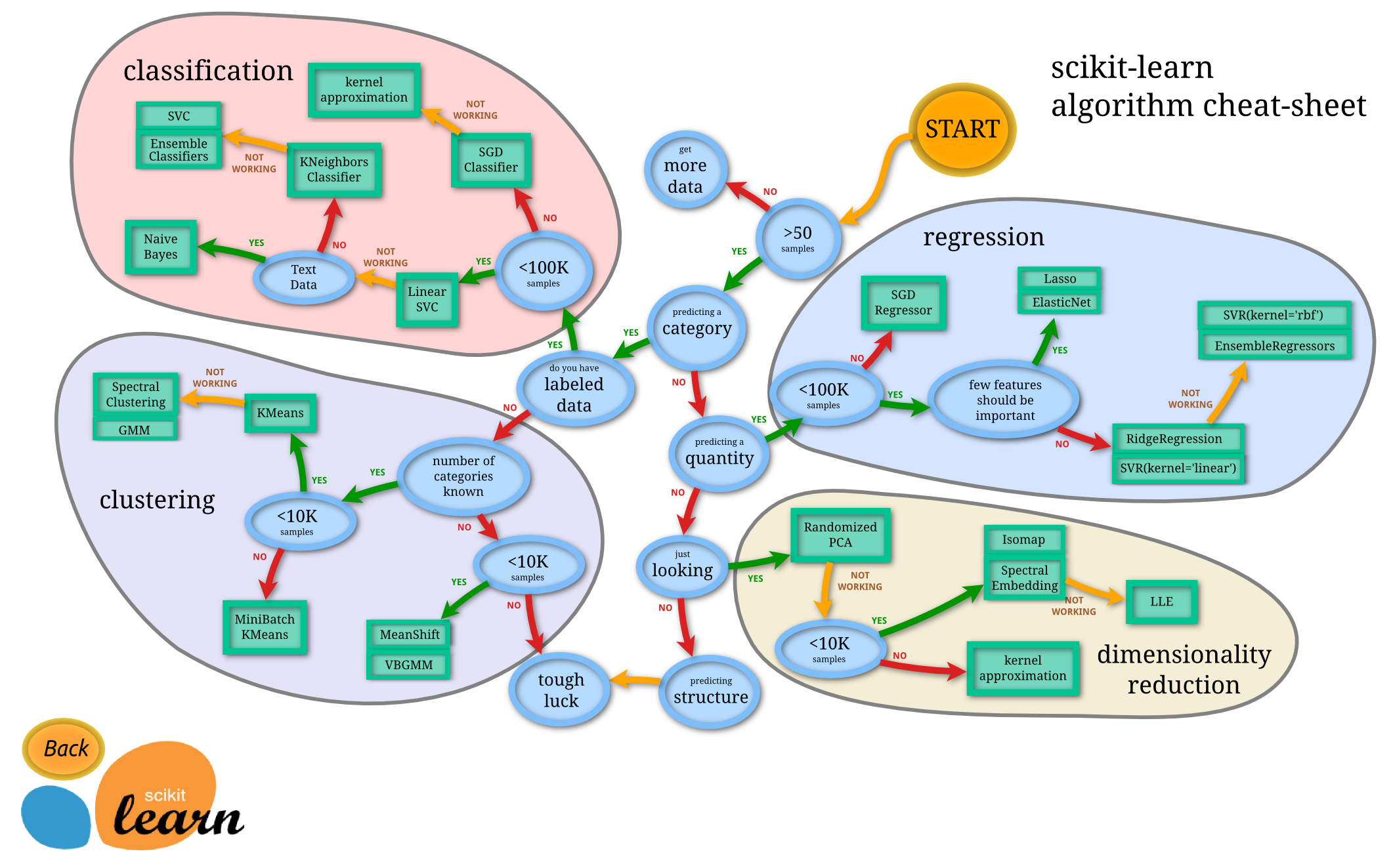
Scikit-Learn Algorithm Cheat Sheet

Azure ML Cheat Sheet
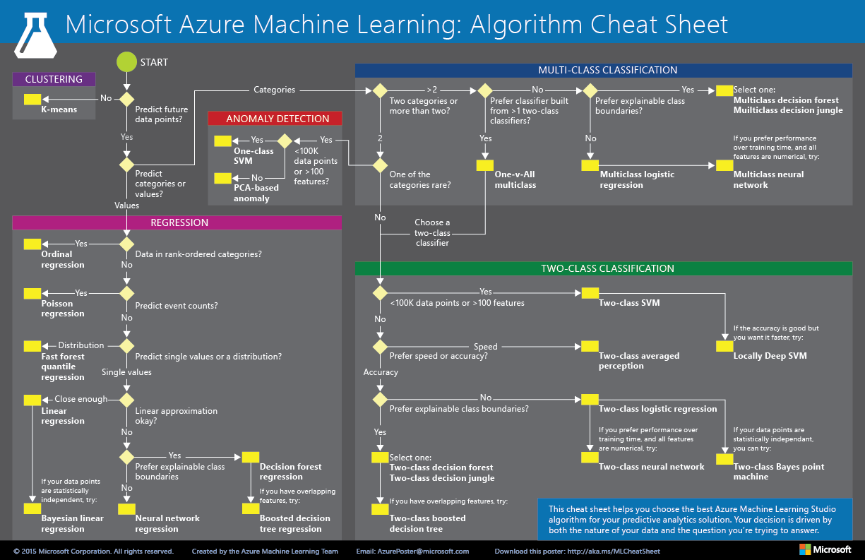
Azure ML Cheat Sheet 2
Train the Model
With Scikit-Learn training a model is as simple as calling the fit() method in a selected model:
# training with NAIVE BAYES
from sklearn.naive_bayes import GaussianNB
nb_model = GaussianNB()

nb_model.fit(data_frame_train_transformed, data_frame_train_labels)
# training with RANDOM FOREST
from sklearn.ensemble import RandomForestClassifier
rf_model = RandomForestClassifier(random_state=42) # Create random forest object

rf_model.fit(data_frame_train_transformed, data_frame_train_labels)
# training with LOGISTIC REGRESSION
from sklearn.linear_model import LogisticRegression
lr_model = LogisticRegression(C=0.7, random_state=42)

lr_model.fit(data_frame_train_transformed, data_frame_train_labels)
Test the Model
Check the performance of selected model
# performance analysis for NAIVE BAYES
from sklearn import metrics

# predict values on TRAINING data
nb_predict_train = nb_model.predict(data_frame_train_transformed)

print("Accuracy on training: {0:.4f}".format(metrics.accuracy_score(data_frame_train_labels, nb_predict_train)))

# predict values on TEST data
test_set_transformed = full_pipeline.fit_transform(test_set) # assuming the data is being transformed via pipeline
nb_predict_test = nb_model.predict(test_set_transformed)

print("Accuracy on test: {0:.4f}".format(metrics.accuracy_score(data_frame_test_labels, nb_predict_test)))
# performance analysis for RANDOM FOREST
from sklearn import metrics

# predict values on TRAINING data
rf_predict_train = rf_model.predict(data_frame_train_transformed)

print("Accuracy on training: {0:.4f}".format(metrics.accuracy_score(data_frame_train_labels, rf_predict_train)))

# predict values on TEST data
test_set_transformed = full_pipeline.fit_transform(test_set) # assuming the data is being transformed via pipeline
rf_predict_test = rf_model.predict(test_set_transformed)

print("Accuracy os test: {0:.4f}".format(metrics.accuracy_score(data_frame_test_labels, rf_predict_test)))
# performance analysis for LOGISTIC REGRESSION
from sklearn import metrics

# predict values on TRAINING data
lr_predict_train = lr_model.predict(data_frame_train_transformed)

print("Accuracy on train: {0:.4f}".format(metrics.accuracy_score(data_frame_train_labels, lr_predict_train)))

# predict values on TEST data
test_set_transformed = full_pipeline.fit_transform(test_set) # assuming the data is being transformed via pipeline
lr_predict_test = lr_model.predict(test_set_transformed)

print("Accuracy on test: {0:.4f}".format(metrics.accuracy_score(data_frame_test_labels, lr_predict_test)))
The accuracy can be deceiving, for example imagine a dataset (skewed, distorted) which as 90% of one class, true for example, and 10% of falses, if you guess that all data is true your accuracy will be 90% correct. For this reason you should have in hand the Confusion Matrix and the Classification Report, which gives a whole set of metrics to analyze.
Metric’s Analysis
# watching metrics only for LOGIST REGRESSION because it gave me (only hypothetically ;)) the best accuracy

print("Confusion Matrix")
print(metrics.confusion_matrix(data_frame_test_labels, lr_predict_test, labels=[1, 0]))

print("Classification Report")
print(metrics.classification_report(data_frame_test_labels, rf_predict_test, labels=[1,0]))
The Confusion Matrix gives us the occurrences in which the algorithm confused one class with another class, hence the name.
The Classification Report gives the precision, recall, f1-score and support, important metrics to better understand the “quality” of your model. With this information we can check the Precision x Recall tradeoff and decide which one is best for the objective. Metrics analysis is a very important topic, it deserves more comments, but for this post i am gonna stay here. May be in the future i can post something only about it.
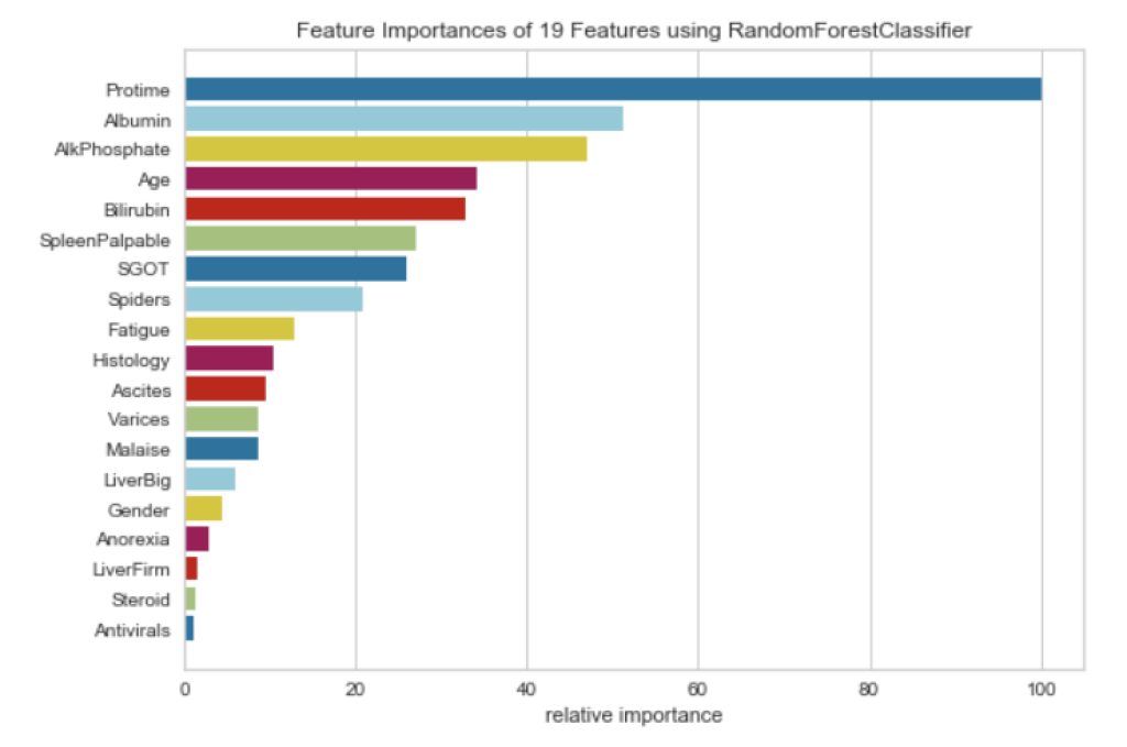
Checking Model Explainability / Feature Importances / Insights
Solutions will be presented to check what features a model thinks are the most important ones and the ones that are not relevant for our model. It can help improve model’s performance and metrics and gives us the opportunity to explain why a model predicted its results. Can be helpful for Debugging, Informing feature engineering, Directing future data collection, Informing human decision-making and Building Trust when presenting the model to health care professionals.
Feature Importances
from yellowbrick.model_selection import FeatureImportances
from sklearn.ensemble import RandomForestClassifier

rf = RandomForestClassifier(n_estimators=10)
viz = FeatureImportances(rf)
viz.fit(X_train, y_train)
viz.show()
Permutation Importance
https://www.kaggle.com/dansbecker/permutation-importance
import numpy as np
import pandas as pd
from sklearn.model_selection import train_test_split
from sklearn.ensemble import RandomForestClassifier

data = pd.read_csv('../input/fifa-2018-match-statistics/FIFA 2018 Statistics.csv')
y = (data['Man of the Match'] == "Yes") # Convert from string "Yes"/"No" to binary
feature_names = [i for i in data.columns if data[i].dtype in [np.int64]]
X = data[feature_names]
train_X, val_X, train_y, val_y = train_test_split(X, y, random_state=1)
my_model = RandomForestClassifier(n_estimators=100, random_state=0).fit(train_X, train_y)
Calculating Importances with Eli5
import eli5
from eli5.sklearn import PermutationImportance

perm = PermutationImportance(my_model, random_state=1).fit(val_X, val_y)
eli5.show_weights(perm, feature_names = val_X.columns.tolist())
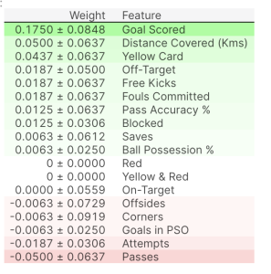
Interpreting Permutation Importances
The values towards the top are the most important features, and those towards the bottom matter least.
The first number in each row shows how much model performance decreased with a random shuffling (in this case, using “accuracy” as the performance metric).
Like most things in data science, there is some randomness to the exact performance change from a shuffling a column. We measure the amount of randomness in our permutation importance calculation by repeating the process with multiple shuffles. The number after the ± measures how performance varied from one-reshuffling to the next.
You’ll occasionally see negative values for permutation importances. In those cases, the predictions on the shuffled (or noisy) data happened to be more accurate than the real data. This happens when the feature didn’t matter (should have had an importance close to 0), but random chance caused the predictions on shuffled data to be more accurate. This is more common with small datasets, like the one in this example, because there is more room for luck/chance.
In our example, the most important feature was Goals scored. That seems sensible. Soccer fans may have some intuition about whether the orderings of other variables are surprising or not.
Partial Dependence Plots
While feature importance shows what variables most affect predictions, partial dependence plots show how a feature affects predictions.
This is useful to answer questions like:
Controlling for all other house features, what impact do longitude and latitude have on home prices? To restate this, how would similarly sized houses be priced in different areas?
Are predicted health differences between two groups due to differences in their diets, or due to some other factor?
If you are familiar with linear or logistic regression models, partial dependence plots can be interpreted similarly to the coefficients in those models. Though, partial dependence plots on sophisticated models can capture more complex patterns than coefficients from simple models. If you aren’t familiar with linear or logistic regressions, don’t worry about this comparison.
We will show a couple examples, explain the interpretation of these plots, and then review the code to create these plots.
import numpy as np
import pandas as pd
from sklearn.model_selection import train_test_split
from sklearn.ensemble import RandomForestClassifier
from sklearn.tree import DecisionTreeClassifier

data = pd.read_csv('../input/fifa-2018-match-statistics/FIFA 2018 Statistics.csv')
y = (data['Man of the Match'] == "Yes") # Convert from string "Yes"/"No" to binary
feature_names = [i for i in data.columns if data[i].dtype in [np.int64]]
X = data[feature_names]
train_X, val_X, train_y, val_y = train_test_split(X, y, random_state=1)
tree_model = DecisionTreeClassifier(random_state=0, max_depth=5, min_samples_split=5).fit(train_X, train_y)
Creating a Partial Dependence Plot using the PDPBox library
from matplotlib import pyplot as plt
from pdpbox import pdp, get_dataset, info_plots

# Create the data that we will plot
pdp_goals = pdp.pdp_isolate(model=tree_model, dataset=val_X, model_features=feature_names, feature='Goal Scored')

# plot it
pdp.pdp_plot(pdp_goals, 'Goal Scored')
plt.show()
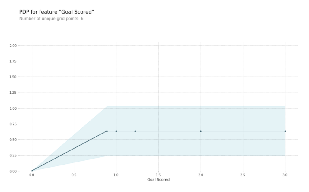
A few items are worth pointing out as you interpret this plot
- The y axis is interpreted as change in the prediction from what it would be predicted at the baseline or leftmost value.
A blue shaded area indicates level of confidence - From this particular graph, we see that scoring a goal substantially increases your chances of winning “Man of The Match.” But extra goals beyond that appear to have little impact on predictions.
2D Partial Dependence Plots
Similar to previous PDP plot except we use pdp_interact instead of pdp_isolate and pdp_interact_plot instead of pdp_isolate_plot
features_to_plot = ['Goal Scored', 'Distance Covered (Kms)']
inter1 = pdp.pdp_interact(model=tree_model, dataset=val_X, model_features=feature_names, features=features_to_plot)

pdp.pdp_interact_plot(pdp_interact_out=inter1, feature_names=features_to_plot, plot_type='contour', plot_pdp=True)
plt.show()
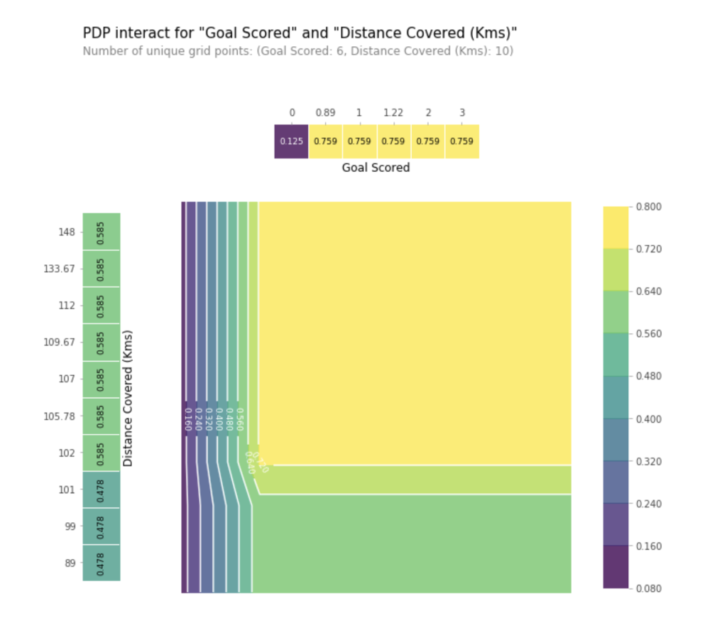
This graph shows predictions for any combination of Goals Scored and Distance covered.
For example, we see the highest predictions when a team scores at least 1 goal and they run a total distance close to 100km. If they score 0 goals, distance covered doesn’t matter. Can you see this by tracing through the decision tree with 0 goals?
But distance can impact predictions if they score goals. Make sure you can see this from the 2D partial dependence plot.
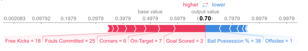
SHAP Values
SHAP Values (an acronym from SHapley Additive exPlanations) break down a prediction to show the impact of each feature.
import numpy as np
import pandas as pd
from sklearn.model_selection import train_test_split
from sklearn.ensemble import RandomForestClassifier

data = pd.read_csv('../input/fifa-2018-match-statistics/FIFA 2018 Statistics.csv')
y = (data['Man of the Match'] == "Yes") # Convert from string "Yes"/"No" to binary
feature_names = [i for i in data.columns if data[i].dtype in [np.int64, np.int64]]
X = data[feature_names]
train_X, val_X, train_y, val_y = train_test_split(X, y, random_state=1)
my_model = RandomForestClassifier(random_state=0).fit(train_X, train_y)
We will look at SHAP values for a single row of the dataset (we arbitrarily chose row 5). For context, we’ll look at the raw predictions before looking at the SHAP values.
row_to_show = 5
data_for_prediction = val_X.iloc[row_to_show]  # use 1 row of data here. Could use multiple rows if desired
data_for_prediction_array = data_for_prediction.values.reshape(1, -1)

my_model.predict_proba(data_for_prediction_array)
array([[0.3, 0.7]])
The team is 70% likely to have a player win the award.
Now, we’ll move onto the code to get SHAP values for that single prediction.
import shap # package used to calculate Shap values

# Create object that can calculate shap values
explainer = shap.TreeExplainer(my_model)

# Calculate Shap values
shap_values = explainer.shap_values(data_for_prediction)
The shap_values object above is a list with two arrays. The first array is the SHAP values for a negative outcome (don’t win the award), and the second array is the list of SHAP values for the positive outcome (wins the award). We typically think about predictions in terms of the prediction of a positive outcome, so we’ll pull out SHAP values for positive outcomes (pulling out shap_values[1]).
It’s cumbersome to review raw arrays, but the shap package has a nice way to visualize the results.
shap.initjs()
shap.force_plot(explainer.expected_value[1], shap_values[1], data_for_prediction)
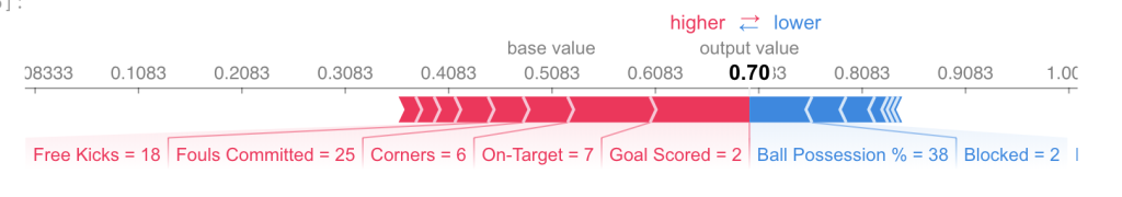
If you look carefully at the code where we created the SHAP values, you’ll notice we reference Trees in shap.TreeExplainer(my_model). But the SHAP package has explainers for every type of model.
- shap.DeepExplainer works with Deep Learning models.
- shap.KernelExplainer works with all models, though it is slower than other Explainers and it offers an approximation rather than exact Shap values.
Here is an example using KernelExplainer to get similar results. The results aren’t identical because KernelExplainer gives an approximate result. But the results tell the same story.
# use Kernel SHAP to explain test set predictions
k_explainer = shap.KernelExplainer(my_model.predict_proba, train_X)
k_shap_values = k_explainer.shap_values(data_for_prediction)
shap.force_plot(k_explainer.expected_value[1], k_shap_values[1], data_for_prediction)
Advanced usage of SHAP Values – TODO
References
https://www.kaggle.com/learn/machine-learning-explainability
https://www.scikit-yb.org/en/latest/api/model_selection/importances.html
https://scikit-learn.org/stable/modules/feature_selection.html
References
Hands-On Machine Learning with Scikit-Learn & Tensorflow
Pluralsight – Understanding Machine Learning with Python
IGTI – Apostila da disciplina Reconhecimento de Padrões
What do you think?